
SOIE
SOIE — meaning Silk in French — is a Canadian natural skincare brand making handmade small-batch body products for the whole family: body butters, bath soaks, shower steamers, a MUM line for expectant and new mothers, and a BEBE line for babies.
Role
Lead Designer
Scope
Brand Identity
Logo Design
Packaging
Shopify E-commerce
Social Media
Relaunch Strategy
The Challenge
The founder's brief was simple: "I want them to look at it and see clean ingredients. The logo had to match that feeling."
Natural skincare is one of the most visually saturated consumer categories. Soft greens and creams, botanical illustration, script typography — the visual language of the category has become a cliché. SOIE needed to stand out without abandoning the warmth and trust that natural skincare buyers expect.
The founder's brief was simple: "I want them to look at it and see clean ingredients. The logo had to match that feeling."
“I want customers to look the product packaging and see clean ingredients. The logo has to match that feeling.”
Constraints
A handmade small-batch product means no factory production runs — packaging had to be practical for manual application at small quantities while still feeling premium enough to compete on a retail shelf. The visual system had to work across four distinct product lines (BODY, MUM, BEBE, FOR HIM) without fragmenting. The BEBE line required its own level of trust-signaling for a parent audience where visual noise actively works against purchase. The relaunch had to modernize without erasing the brand equity the first version had already built.
The first version launched and lived in the market. We learned from it. In 2023 we relaunched with a refined logo, updated packaging, and a rebuilt Shopify website — responding directly to what the market had told us. That relaunch took SOIE from direct-to-consumer to stocked in 10 shops across North America.

Visual Direction
The name SOIE — Silk — gave the visual direction its register. Silk is smooth, refined, tactile. It suggests quality without loudness. Clean lines, generous whitespace, modern typography with enough warmth to feel human rather than clinical.
The 2023 colour update moved the palette away from cold whites toward something warmer — closer to the product itself. Approachable rather than distant.
Packaging
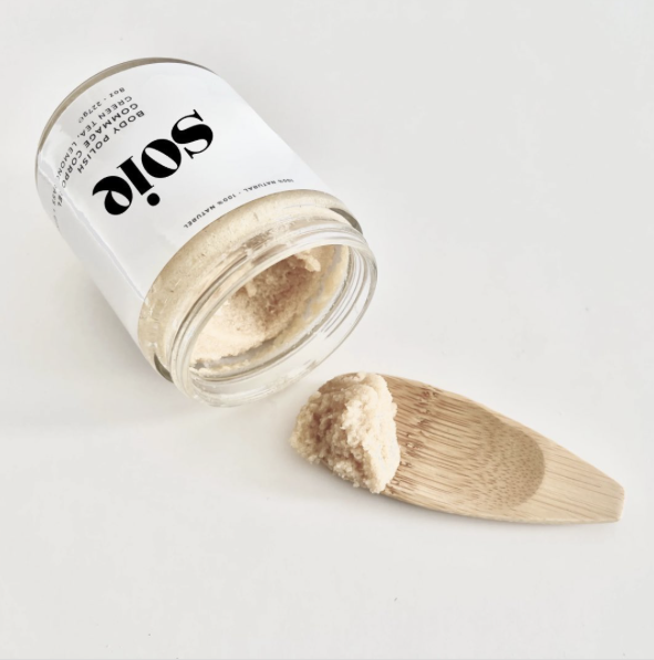
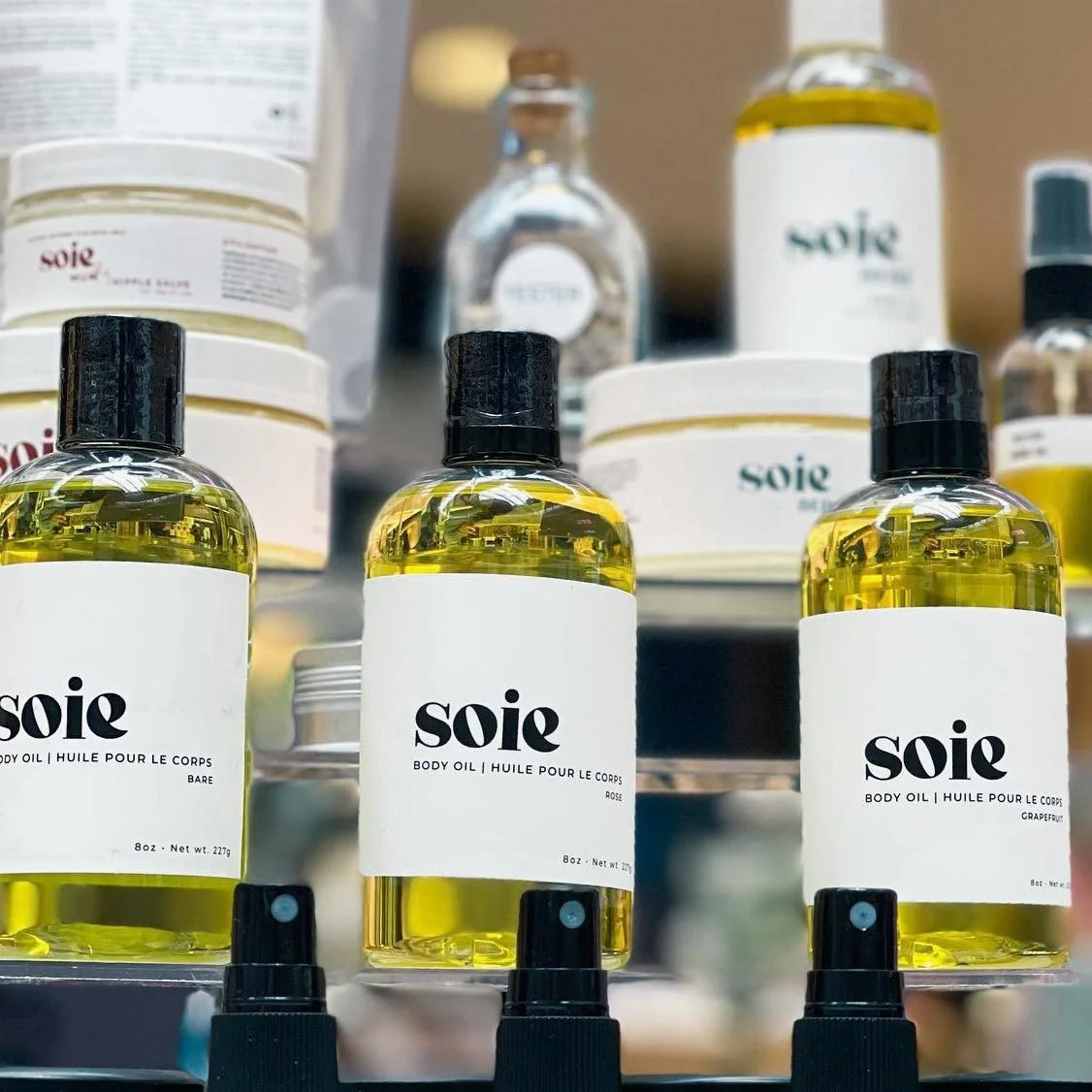
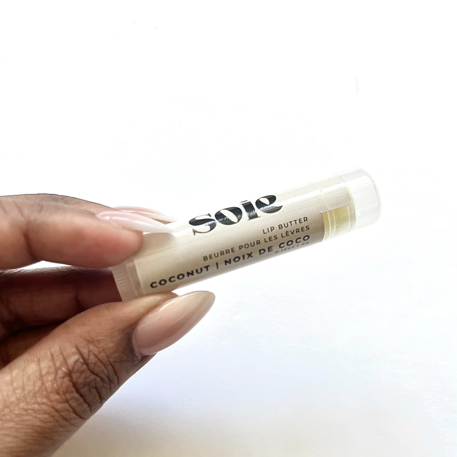
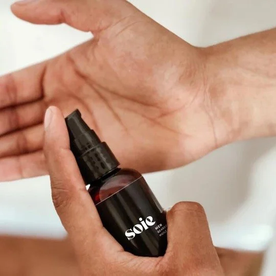
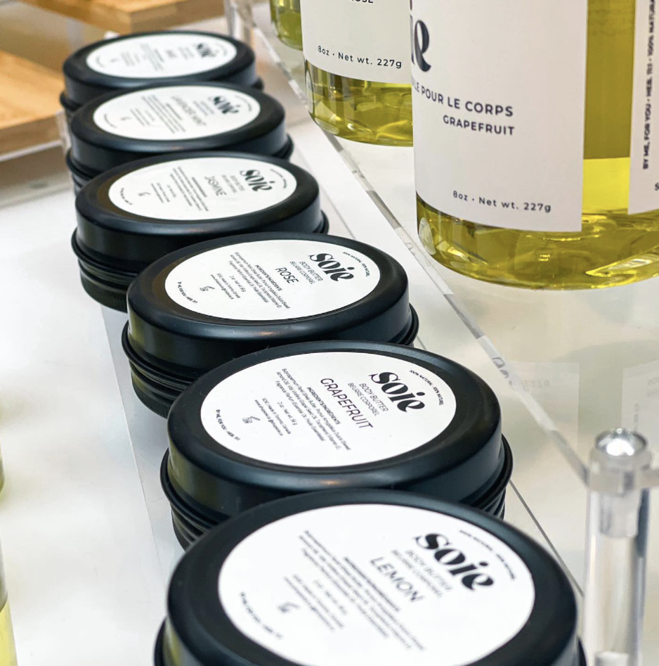
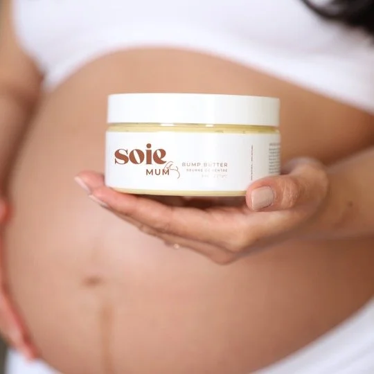
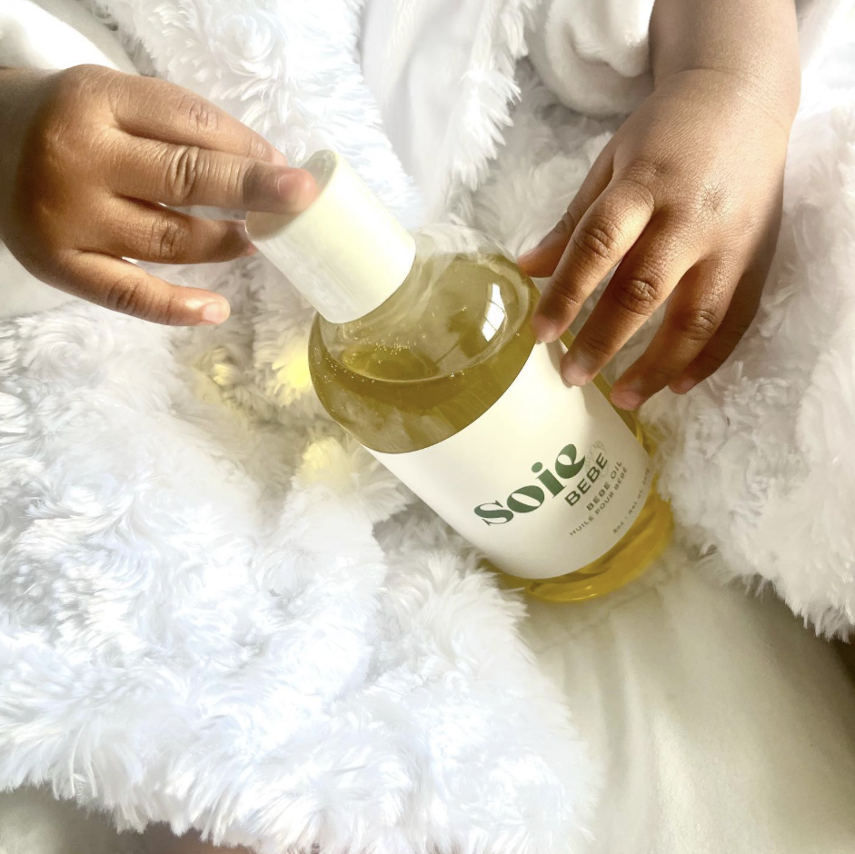
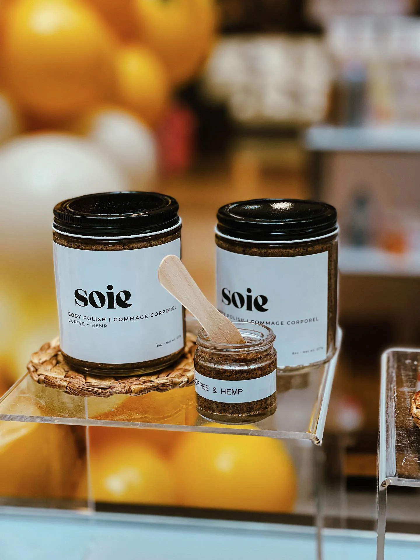
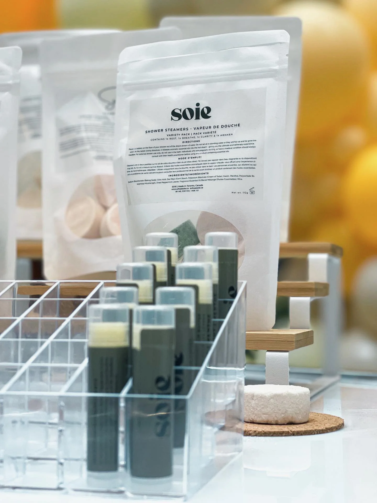
Vinyl waterproof labels matched both the practical needs of a handmade product and the clean aesthetic of the brand. Labels were designed to sit flush and minimal on each format, letting the product colour and texture show through rather than covering it with decoration.
The BEBE line required a specifically gentler treatment within the SOIE system — same clean language, softer application — simple enough to meet the trust bar a parent applies to anything touching a baby.
Shopify Website
The e-commerce site was built to make buying feel as considered and personal as the products themselves. Natural skincare buyers research before purchasing — they read ingredients, look for brand story, want to know who made this.
The site leads with that. Brand story surfaces early. Product pages lead with ingredients before price. Navigation is organized around the family categories making it immediately clear SOIE has something for everyone.
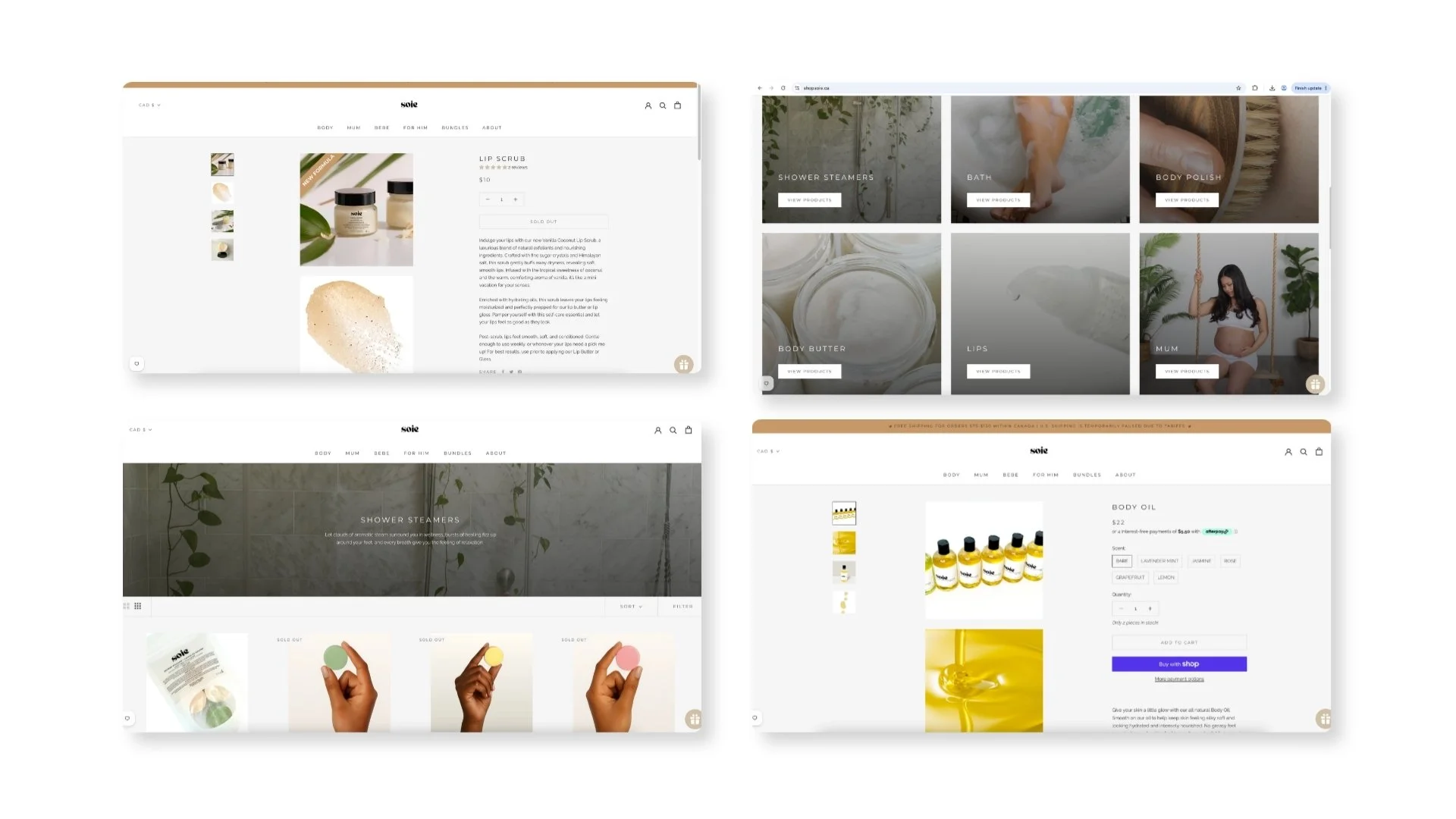
The logo became more timeless. The packaging warmed. The BEBE line simplified to meet the specific trust bar of a parent audience. The website was rebuilt to reflect what the first version had taught us about how SOIE customers actually shop.
Every change in the relaunch was a response to something real, not a creative preference.
Results
40% increase in website sales following the relaunch. Now stocked in 10 shops across North America.
Reflection
The first version of a brand is research. It goes into the market, people respond to it, and you learn things no amount of upfront strategy could have told you. The 2023 relaunch was better because the first version existed and because we were willing to look honestly at what the market was telling us and respond to it. That willingness to go back and rebuild without ego is something I now bring to every project.