
MEDA
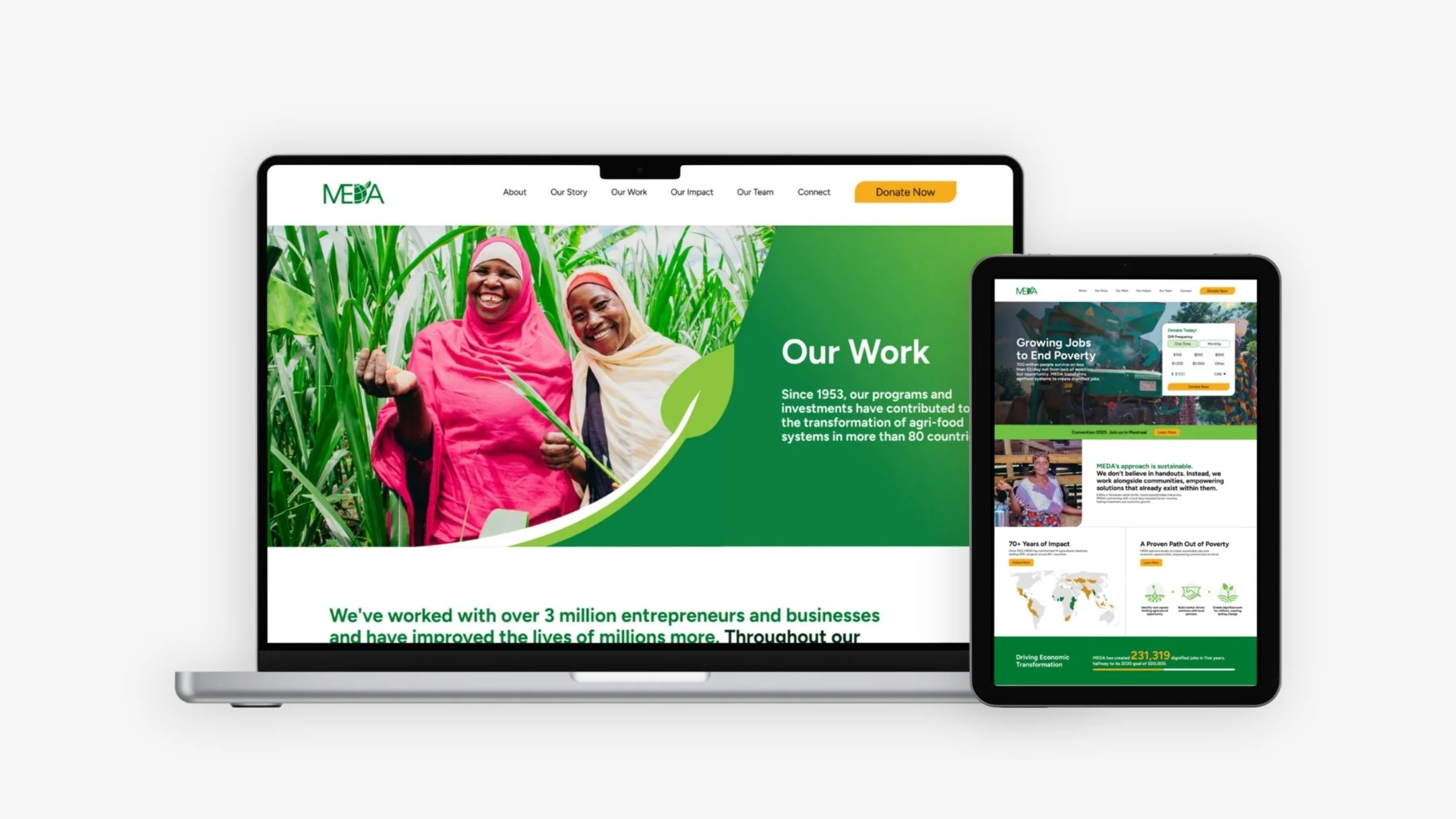
MEDA is an international economic development organization with over 70 years of impact across 80+ countries. Their website was rich with stories, programs, and impact data — but none of it was working in service of their primary goal: donor conversion.
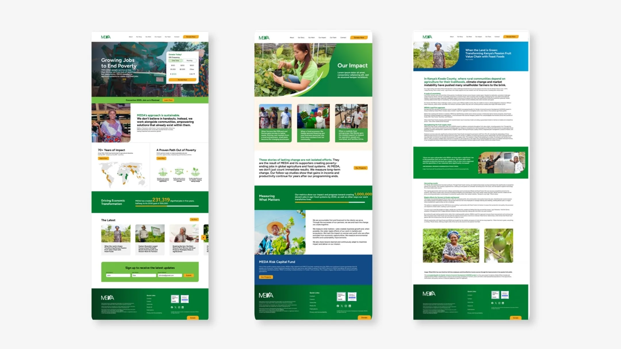
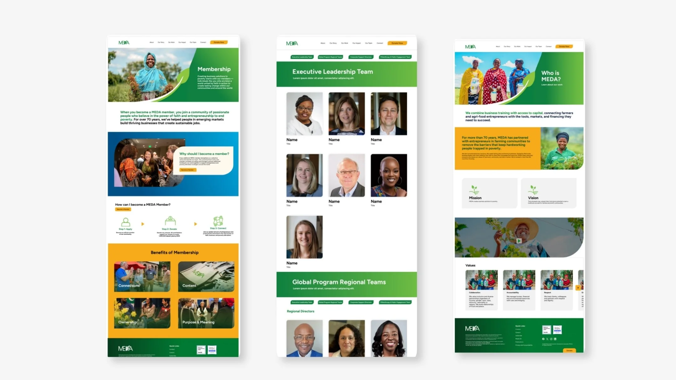
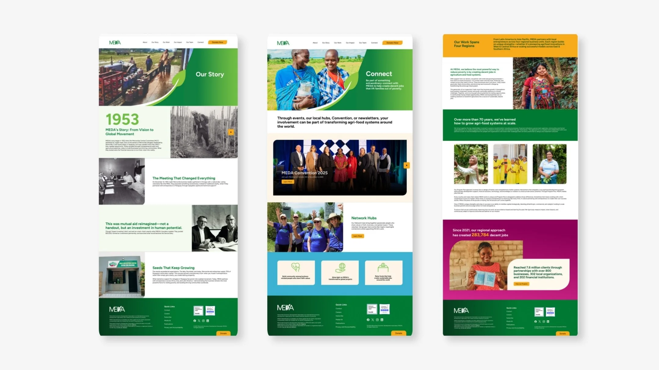
I led the redesign from discovery through developer handoff, designing nine scalable page templates, a full component library, and a visual motif system built around the MEDA leaf logo mark.
Role
Lead Designer
Scope
UX Research
Information Architecture ·
UI Design
Design Systems
Accessibility
Developer Handoff
Year
2025
The Challenge
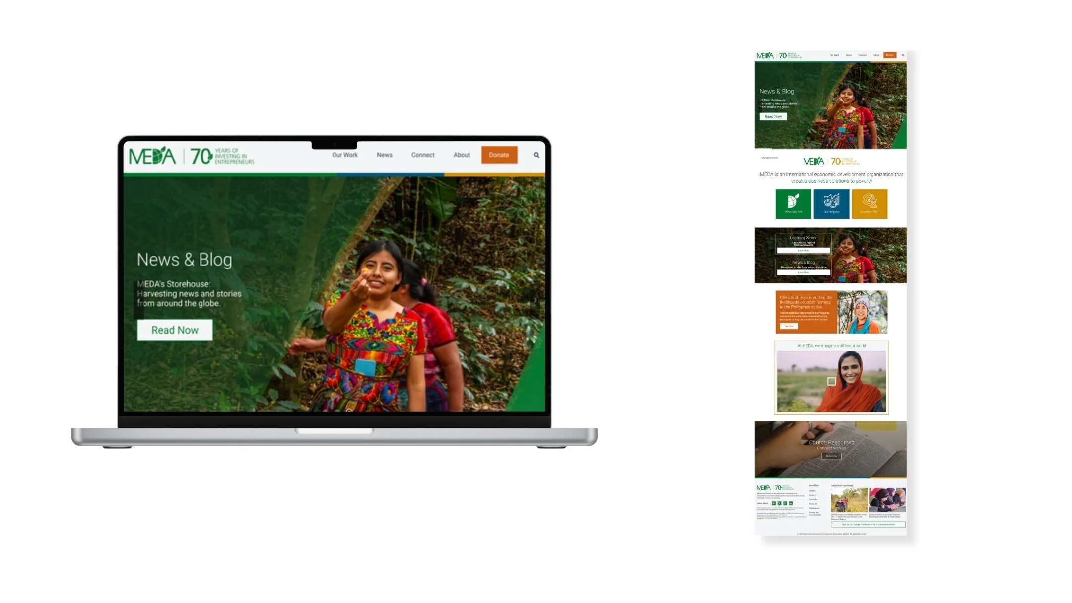
MEDA's content problem was masquerading as a design problem. The stories existed. The hierarchy did not. Visitors were landing on a content-heavy site with no clear path to giving. The donation CTA competed with editorial content rather than complementing it.
The question I designed around: how do we sequence the experience so that MEDA's stories lead visitors toward a giving moment rather than away from it?
Constraints
A 70-year-old organization with deeply established internal structures meant navigation had to be redesigned around user intent rather than how MEDA organizes itself internally. The existing colour palette had WCAG accessibility failures that needed to be resolved before any layout work could begin. The client needed a system, not individual pages — 200+ pages had to be powered by a manageable set of templates.
Understanding the Landscape
Before opening Figma, I spent time understanding where the existing donor experience was breaking down. I audited the current site, documenting friction points in the donor journey, interviewed stakeholders to understand content priorities, and benchmarked organizations like World Vision, Oxfam, and CARE Canada to identify patterns across high-performing nonprofit websites.
One pattern stood out: the strongest nonprofit experiences lead with human stories and create a clear path to giving. The donation moment isn't buried—it’s easy to find and easy to complete.
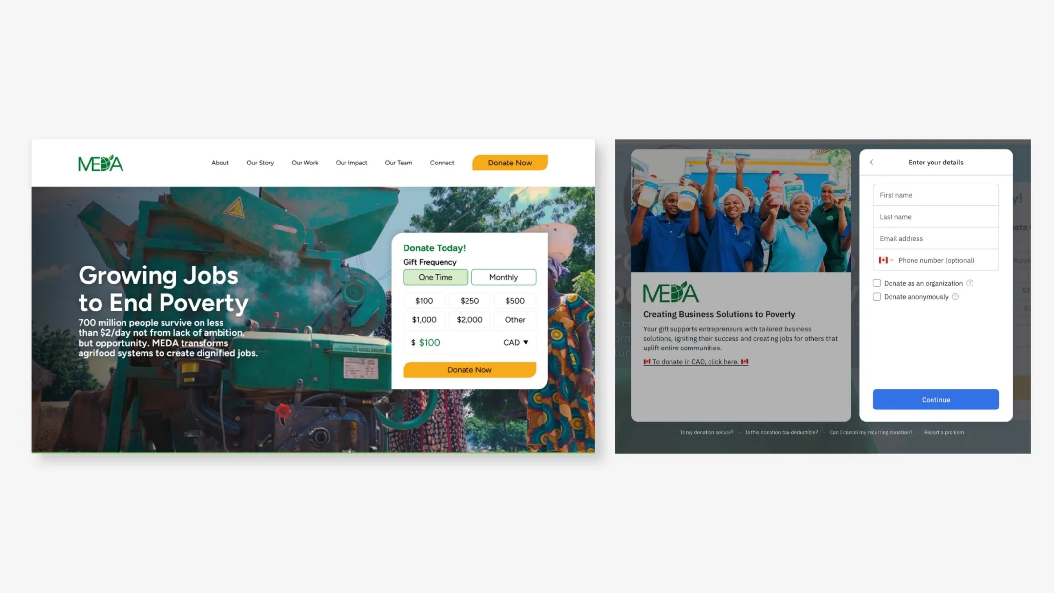
That insight shaped one of the biggest decisions in the redesign: the donation experience needed to be central to the site and accessible from a single, straightforward flow.
The previous donor experience split the process across two separate pages, creating unnecessary friction. In the new experience, users can complete the entire donation journey from a single screen, reducing navigation and keeping the focus on the action that matters most.
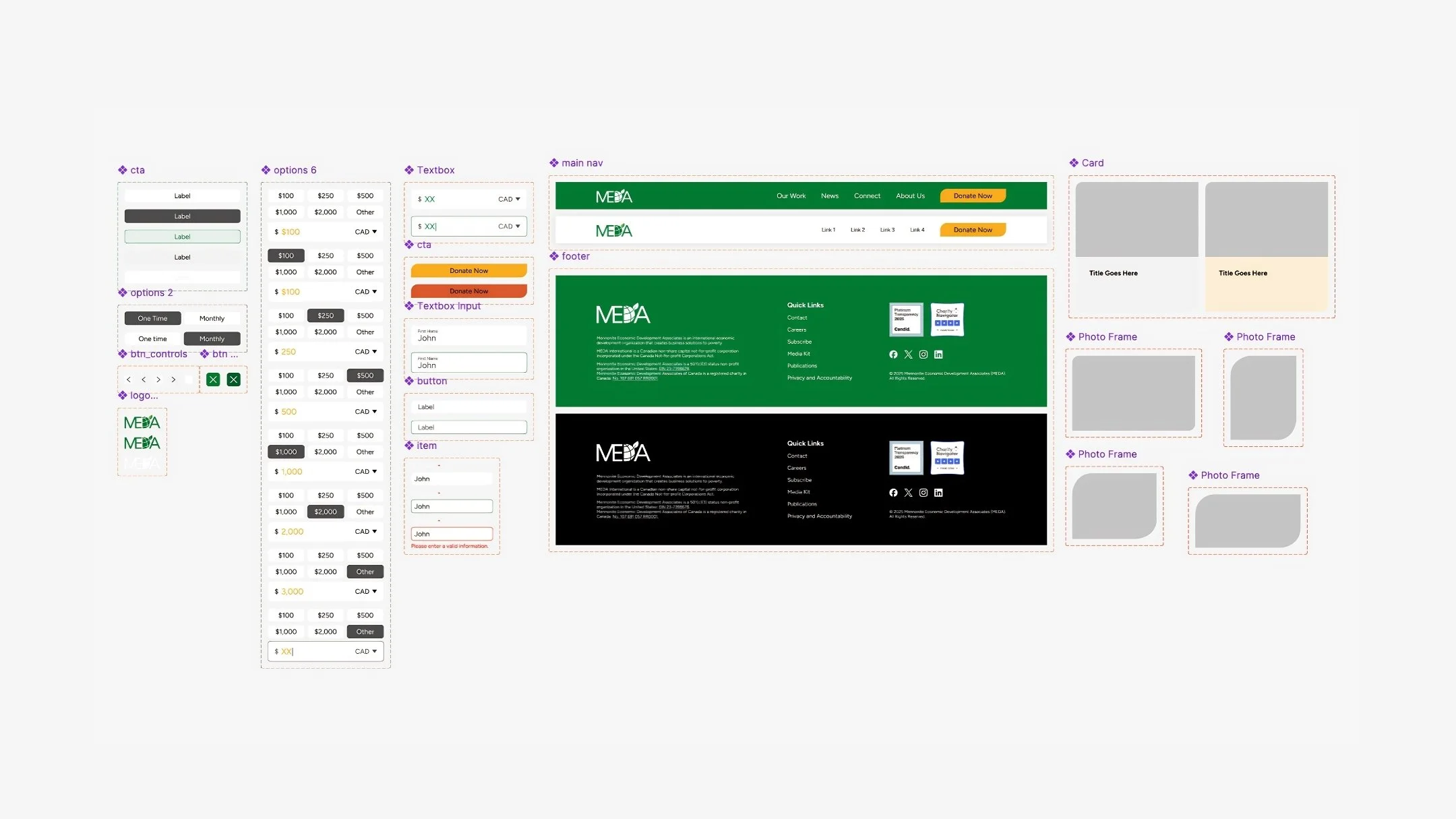
The Leaf Housing System
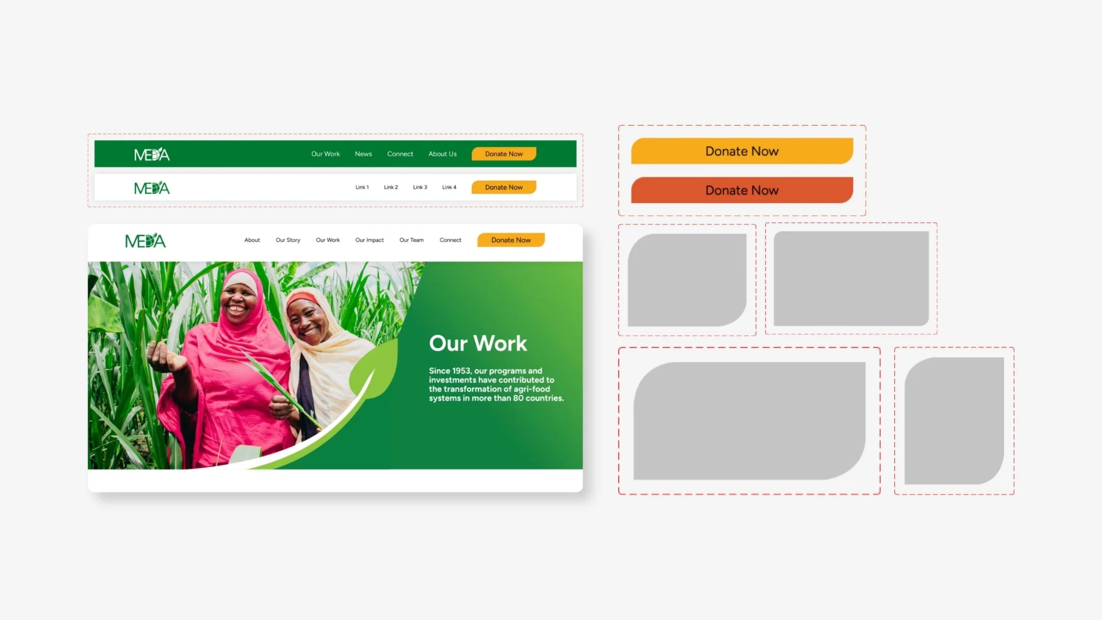
The most distinctive design decision of the redesign was extending MEDA's leaf logo mark into a full visual system that runs through every layer of the interface.
The leaf system has five applications across the site:
Page headers: A custom leaf-shaped header treatment sits at the top of every page type anchoring the brand at every entry point.
Photo frames: Imagery across the site is housed inside leaf-shaped containers. Photos of MEDA's work in the field are framed within the leaf shape making even editorial photography feel native to the brand.
Content containers: Key content blocks and callout sections use leaf-shaped containers to group information creating a consistent visual rhythm across all nine page types.
The donation CTA button: The Give button in the navigation is leaf-shaped, directly echoing the logo mark. Every call to give is tied back to the brand identity.
The logo connection: All five applications trace back to the same source. A user who never consciously notices the leaf still feels the coherence it creates.
Accessibility
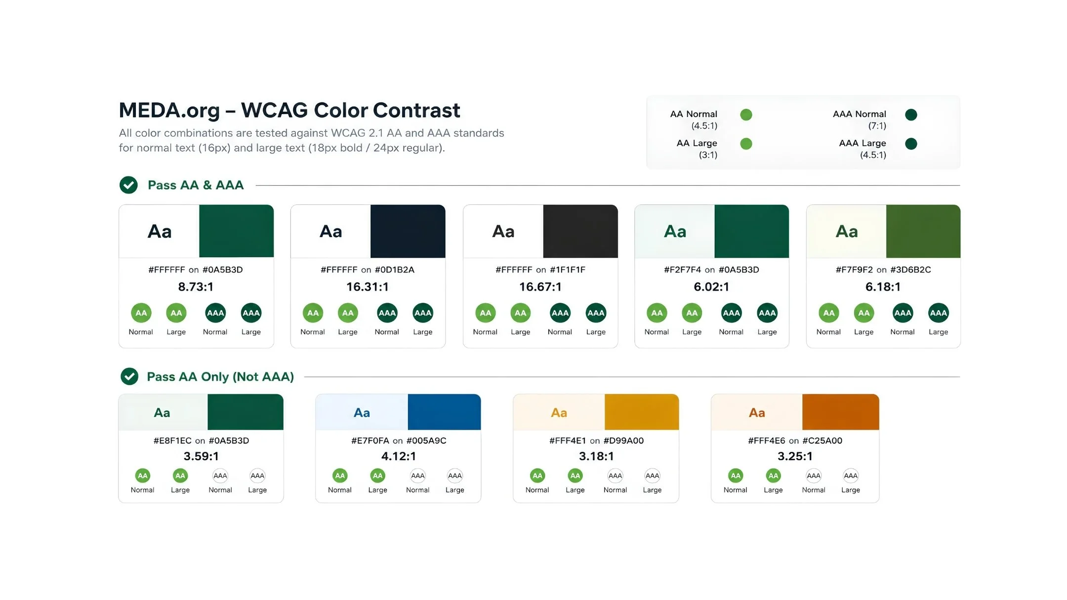
The existing colour palette had contrast failures across multiple text and background combinations. I rebuilt the colour system from the ground up, testing every pairing against WCAG standards before applying it to any layout. Every combination in the final system is compliant.
Results
Nine page templates powering 200+ live pages. Full component library used as the direct foundation for development handoff. Rebuilt accessible colour system applied across all page types. Positive stakeholder feedback throughout with the design recognized for balancing editorial depth with a clear donor journey.
Reflection
On a nonprofit site, emotion and conversion are not at odds. The right story in the right sequence is the most powerful CTA you have. The leaf system taught me that a single well-considered motif applied consistently across an interface creates more brand coherence than any amount of visual decoration.