
Kinvia
Canadian Feed the Children was changing its name to Kinvia — one of the most sensitive communication moments an organization can face. A name change for a nonprofit with decades of donor trust isn't just a rebrand. It's a question that has to be answered honestly: why, and what stays the same?
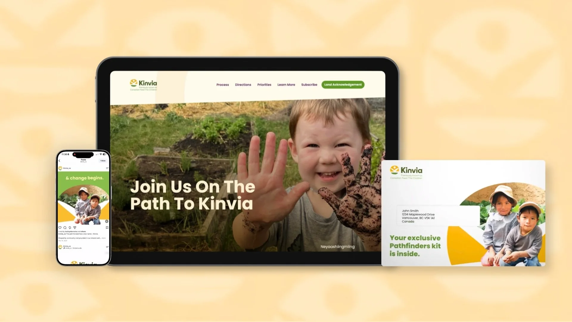
I designed a dedicated scroll-based narrative page to guide both longtime CFTC stakeholders and first-time Kinvia visitors through that story, alongside a motion social campaign for the launch and a path motif system that became the visual language across every channel.
Role
Lead Designer
Scope
UX Design
Narrative Design
Motion Design
Developer Handoff
Cross-Channel Design System
Year
2025
The Challenge
This was not a typical marketing page. It had to reassure existing stakeholders that the organization's mission was unchanged, introduce Kinvia to people encountering it for the first time, and communicate a narrative involving Indigenous reconciliation and decolonization with genuine care and accuracy.
Getting the tone wrong — too celebratory, too clinical, too vague — would undermine the message entirely.
Constraints
Two completely different audiences had to be served by one page without it feeling like it was trying to do two things at once. The page needed to function as a design guide for the developer to translate into a full site, social system, and print campaign — making consistency across every application a constraint from day one.
Scroll-Based Narrative
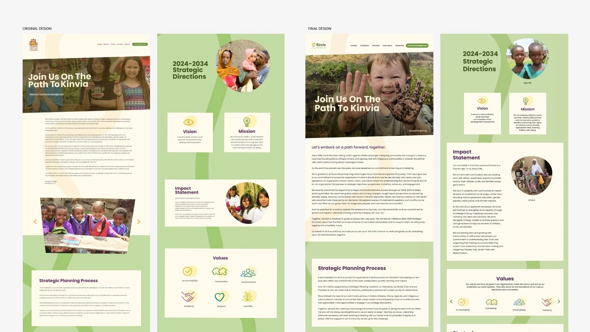
I started with wireframes to map the content hierarchy and narrative flow before committing to any visual direction. The scroll-based format was a deliberate choice — it mirrors the way a story unfolds. You arrive not knowing quite what Kinvia is and leave understanding not just the new name but why it matters.
The sequencing served both audiences: the opening sections addressed the why of the change, followed by organizational history for existing stakeholders, followed by a forward-looking vision for new visitors.
The Path Motif System
The page name — The Path to Kinvia — was not just a title. I made the path a literal visual element woven through the scroll experience, guiding the reader through the narrative the same way a physical path guides someone through a landscape.
The decision went further than the page. The path became the organizing visual principle for the entire Kinvia rebrand — carried through to the main website, social media campaign, and print materials. One motif, every channel.from the design.
Sensitive Content
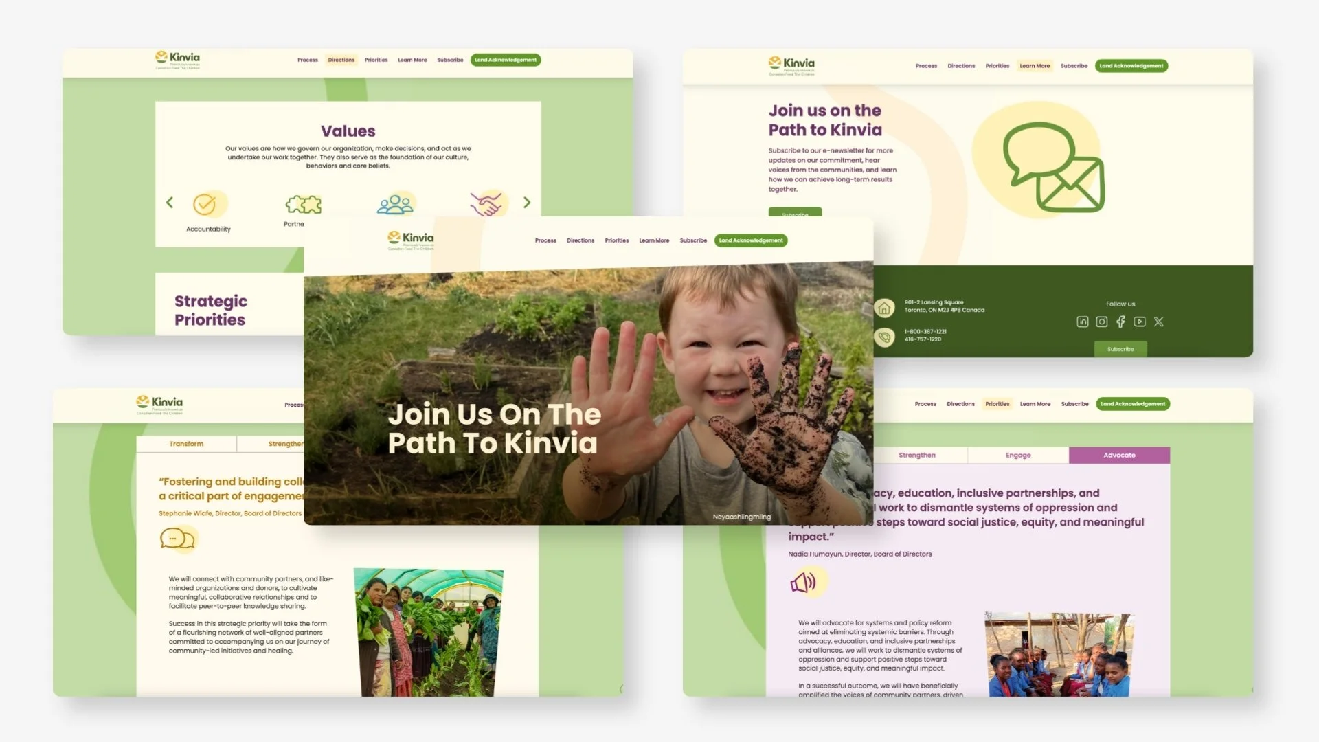
The name change narrative touched on Indigenous reconciliation and decolonization. Those sections were designed quieter — more whitespace, heavier type weight, no decorative elements. The content needed room to be read carefully, not scanned.
Design restraint is a skill. The instinct on a brand launch is to make things feel exciting. For these sections, pulling back was the right call.
Developer Handoff
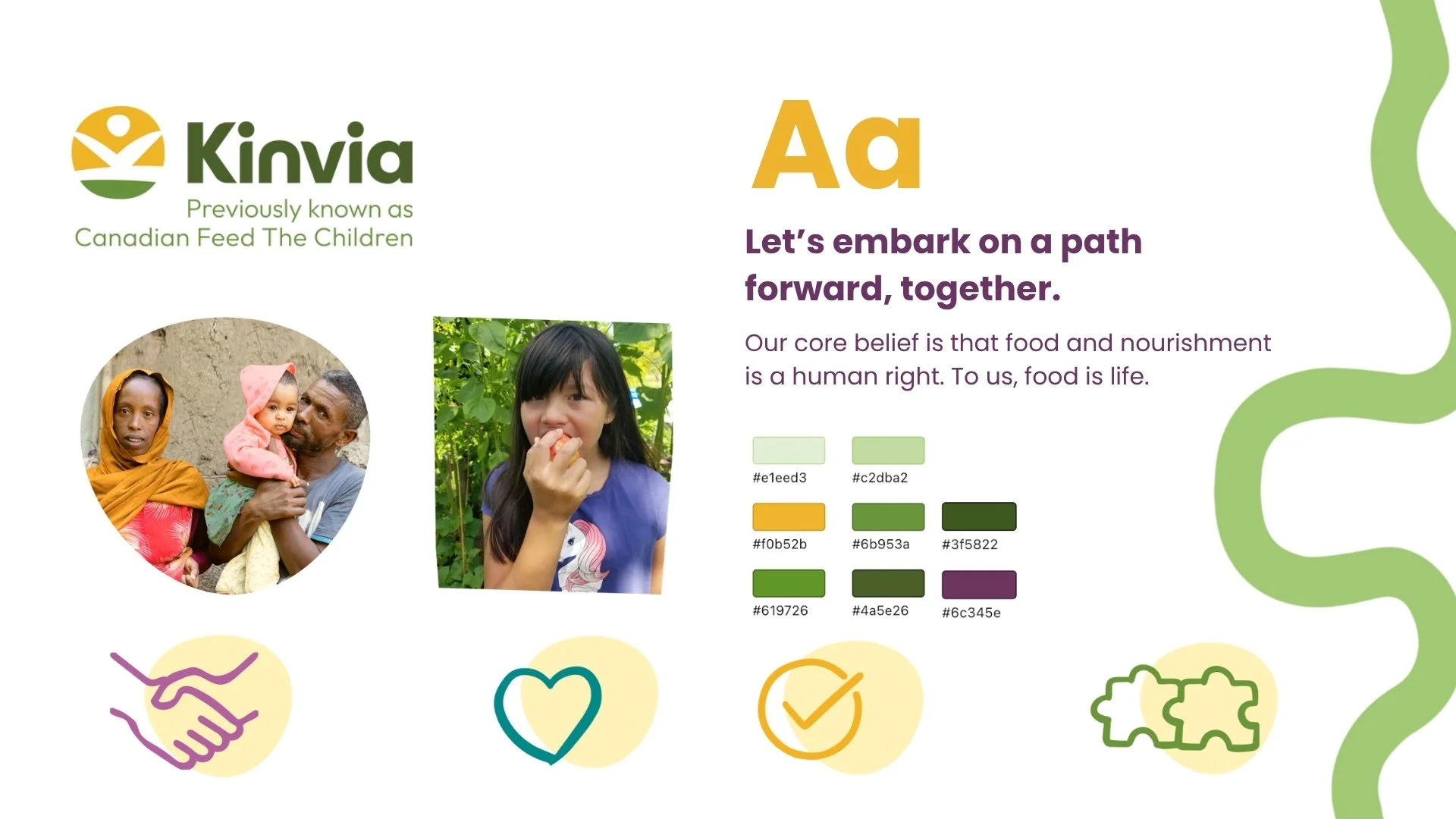
Rather than handing off a Figma file and hoping for the best, I created a structured style guide for the developer covering type hierarchy, spacing rules, colour usage, icons and section-by-section layout intent. For a page this nuanced in tone, documenting the intent behind each decision reduced the risk of the build drifting from the design.
Print & Digital Campaign
I designed a series of motion social ads and print ads for the name launch — the same tonal challenge as the page, but in formats with seconds to land. The animation approach carried the path motif into motion, while the print work extended it into a tangible visual system, using the motif as the through-line connecting every ad in the campaign.
Results
Page launched as the public-facing announcement of Kinvia's new identity. Stakeholder feedback recognized the design for handling the sensitivity of the name change narrative with care and honesty. The path motif carried through to the full brand system across web, social, and print.
Reflection
This project taught me that design restraint is a skill you have to practice. The page works because it respects its audience enough to tell them the real story. The path motif works because it came from the content, not from a visual mood board. When a design decision grows organically from what something is actually trying to say, it tends to last.