Helping Hands
Healthcare
Scope
Brand Identity, Website & Social Media
Overview
Helping Hands Healthcare has been a trusted provider of temporary staffing solutions for hospitals and homecare clients across the Greater Toronto Area and Niagara since 1997. With nearly three decades of experience, the organization had built a strong reputation, but their digital presence wasn't reflecting it.
They were ready to change that. The goal was to modernize the brand across every touchpoint, starting with a full website redesign and extending into a refreshed social media presence that could carry the new identity forward consistently.
Challenge
Healthcare is one of the most emotionally charged spaces a designer can work in. The people searching for homecare services are often overwhelmed, stressed, and looking for reassurance as much as information. The previous website wasn't meeting them where they were — the structure was difficult to navigate, the visual language felt dated, and the overall impression didn't reflect the warmth and professionalism Helping Hands Healthcare was known for in person.
The challenge was twofold: redesign the website to earn trust immediately, and build a social media presence that extended that same feeling of care and credibility into the feed.
Discovery & Approach
Before any design work began, I spent time understanding who was actually using the website and what they needed most. For Helping Hands Healthcare, the primary users weren't just healthcare professionals looking for staffing solutions — they were also families and individuals navigating the often stressful process of finding homecare support for a loved one.
That insight shaped everything.
Audience Needs Users arriving at the site were often in a high-stress moment. The design had to do two things immediately: reduce cognitive load and build emotional trust. Every structural and visual decision was made with that in mind.
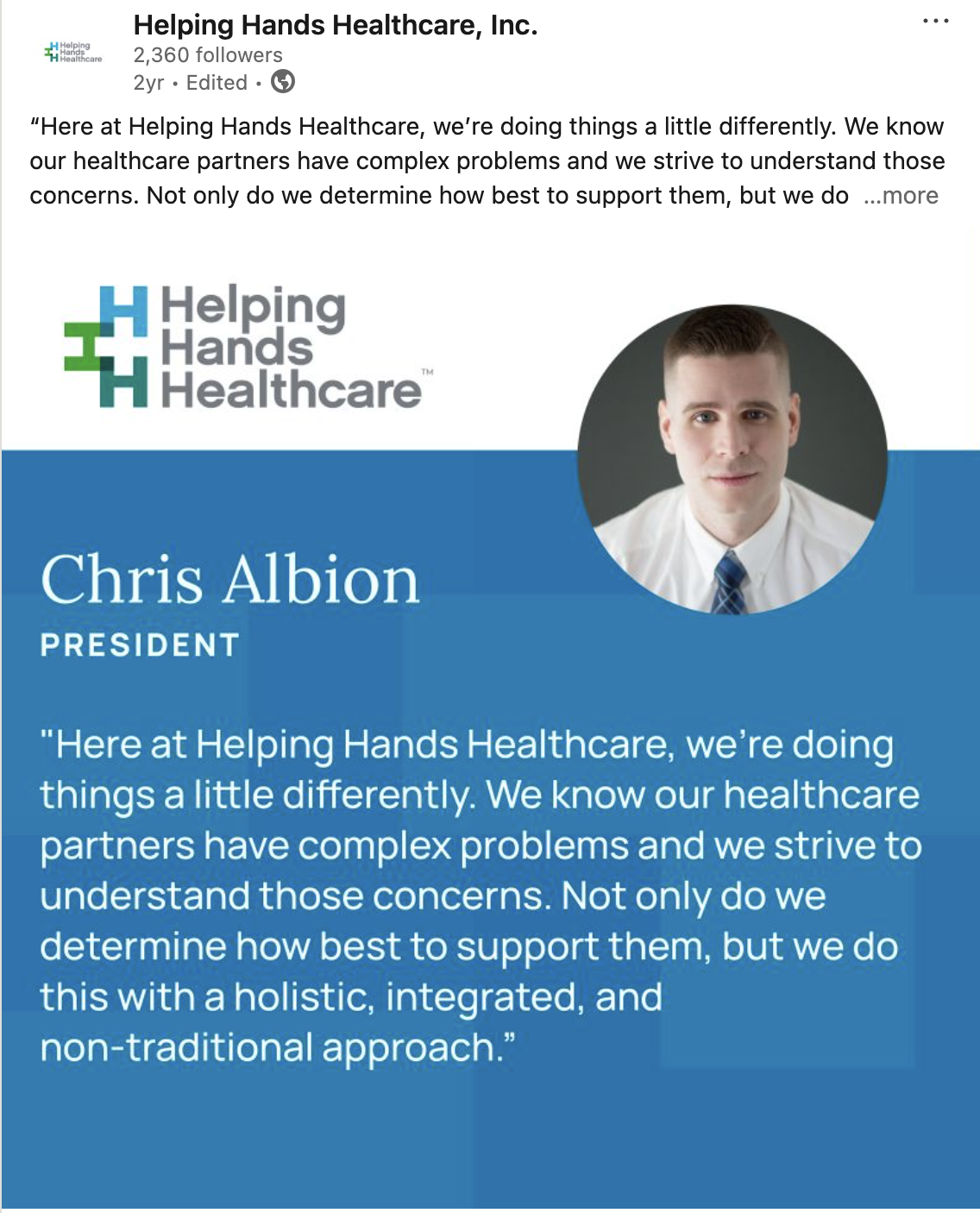
Visual Identity Before touching the website or social channels, we established a refreshed visual identity — a cohesive system of color, typography, and imagery built to anchor every touchpoint consistently.
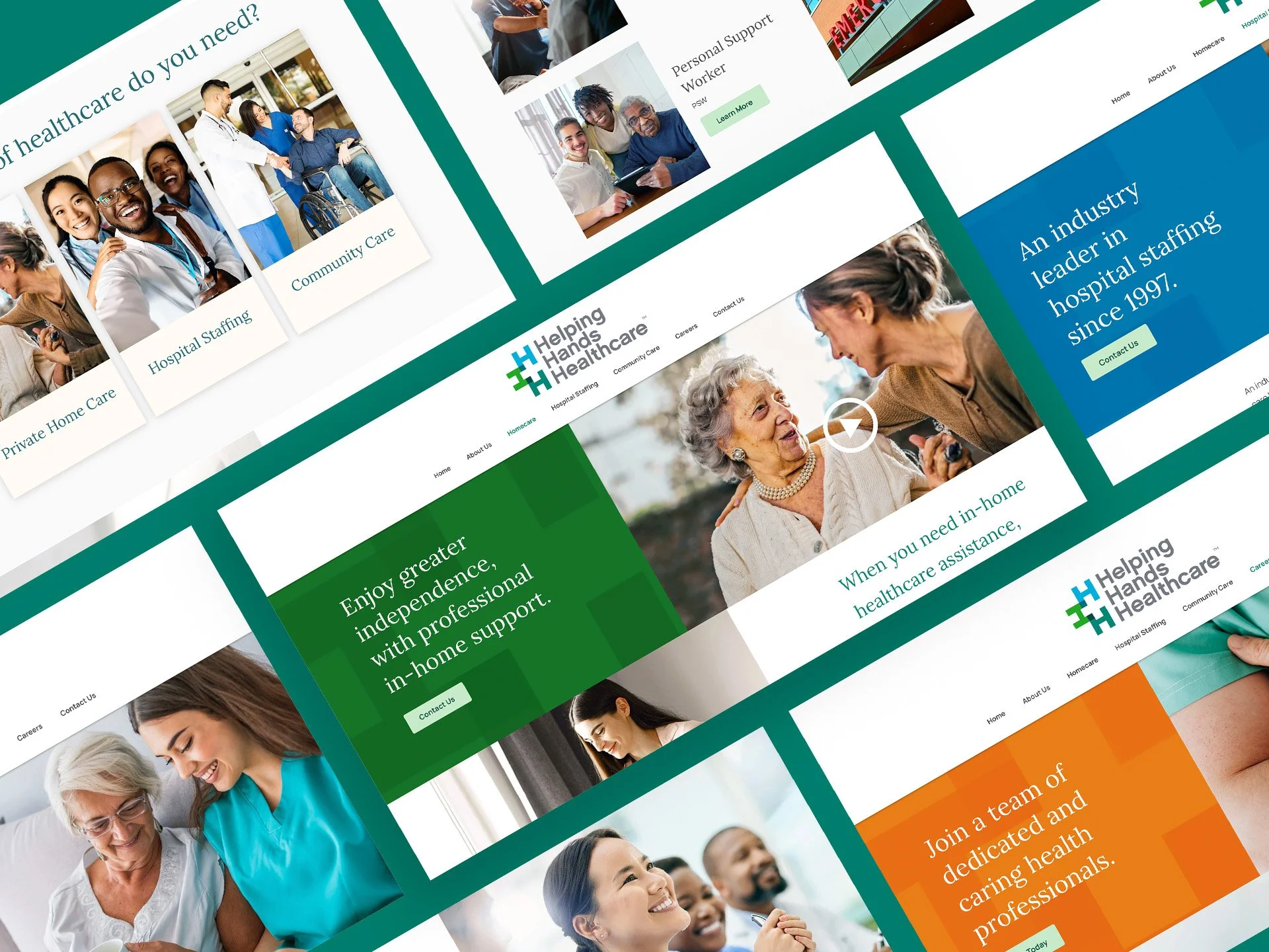
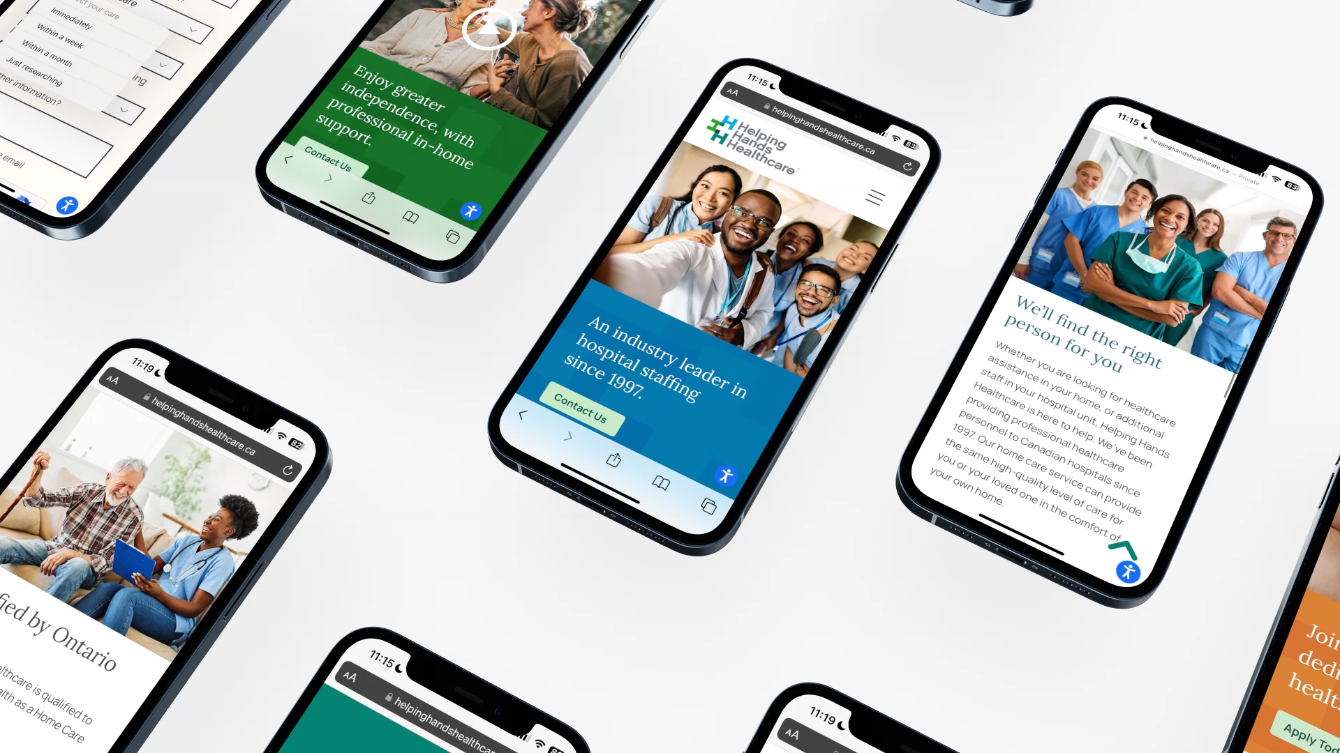
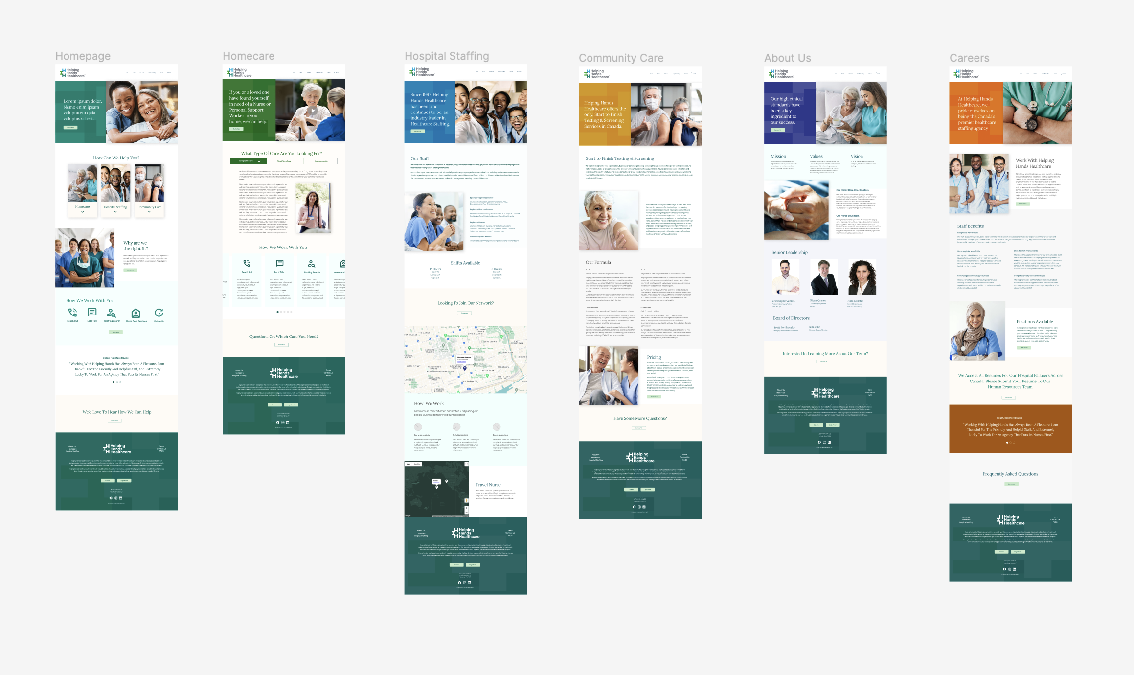
The updated palette moved toward warmer, brighter tones that felt approachable and human, without sacrificing the professionalism the brand had built over nearly three decades. A custom design mark built from interlocking H's became the visual anchor of the brand — appearing as a textural element across website backgrounds and social graphics, giving Helping Hands Healthcare an ownable signature that was instantly recognizable across every channel.
Website Design
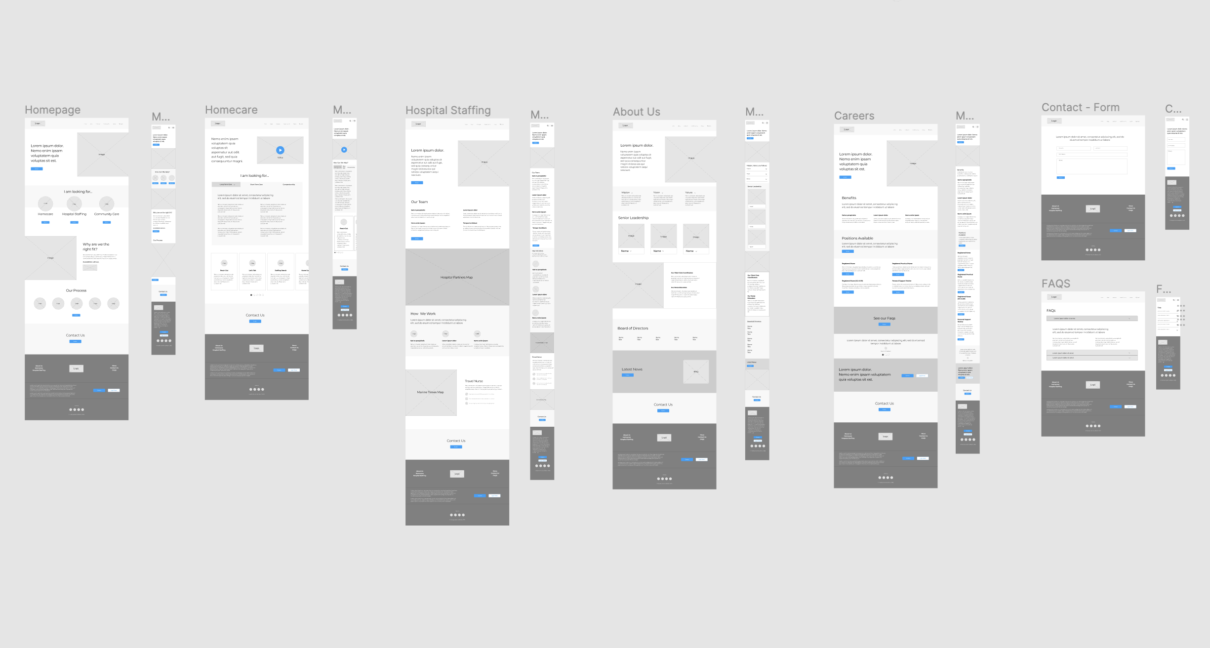
With the identity in place, I led the full UX and UI redesign of the Helping Hands Healthcare website.
Compassionate Messaging The content was rewritten to meet users with empathy — acknowledging the concerns and fears that often accompany a search for homecare, and guiding them toward the right solution without overwhelming them.
Simplified Structure The site's information architecture was reorganized around user priorities, not organizational hierarchy. The most important information — services, how to get help, and who to contact — became accessible within one or two clicks from the homepage.
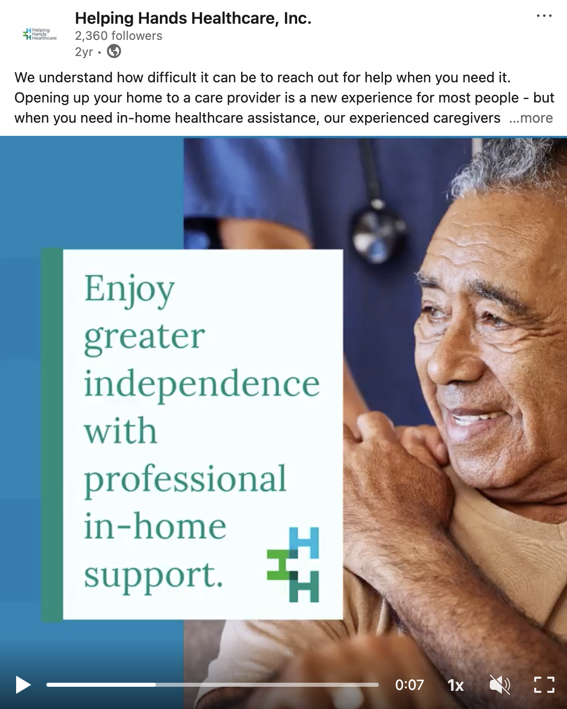
Visual Storytelling Imagery was carefully selected to communicate warmth, professionalism, and genuine care. Every photo choice was intentional — reflecting the real humans behind the service, not generic stock photography.
Performance & Accessibility The redesign was built with performance and inclusion as non-negotiables. The result speaks for itself: the site now loads 80% faster, averaging under 2 seconds, and meets AA WCAG accessibility standards — placing it among the top 3% of accessible websites globally as reported by Accessibe.
Social Media Refresh
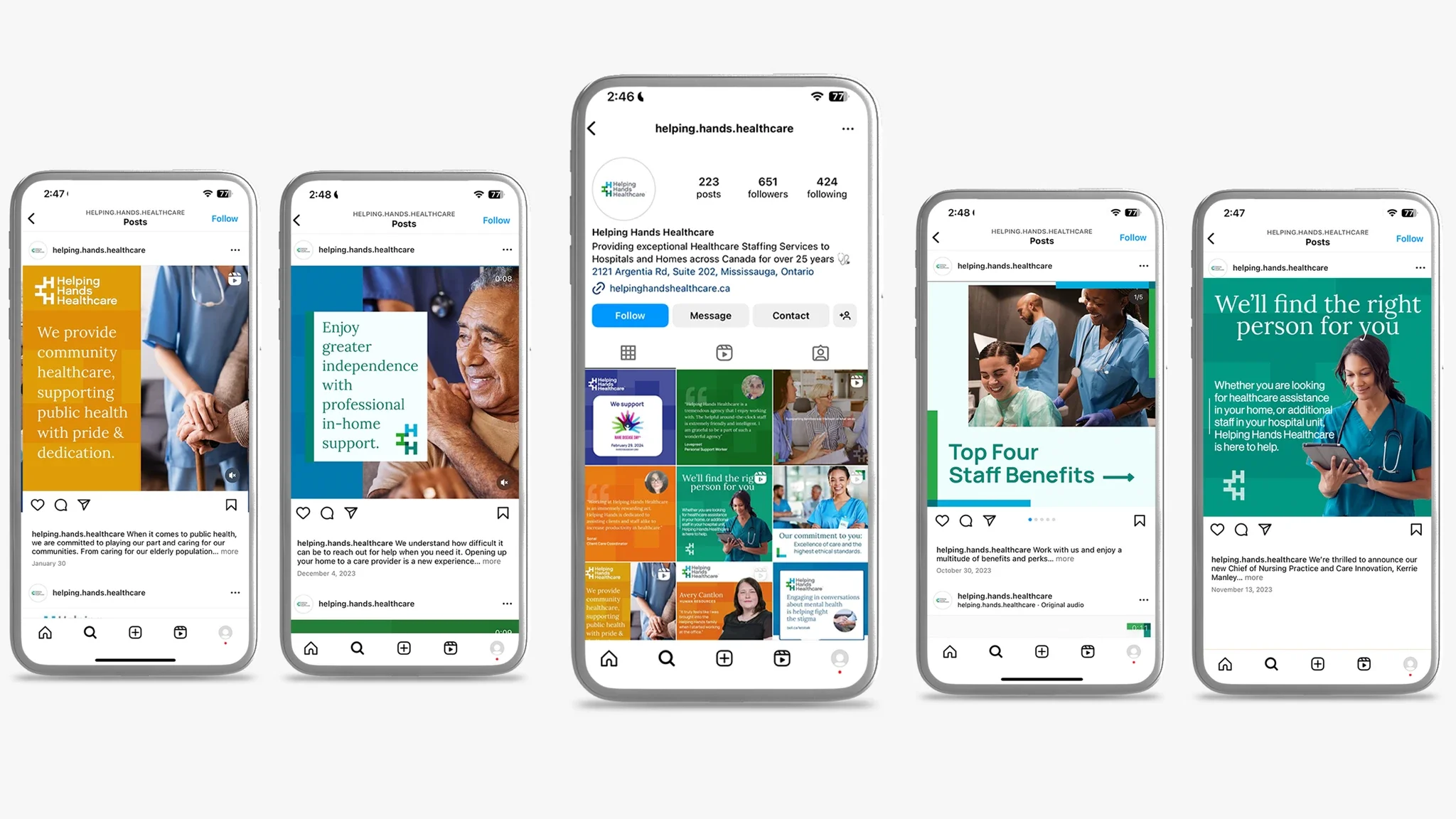
The website redesign was only half the story. To ensure Helping Hands Healthcare showed up consistently wherever their audience was, the social media channels were updated to fully reflect the new visual identity and messaging framework.
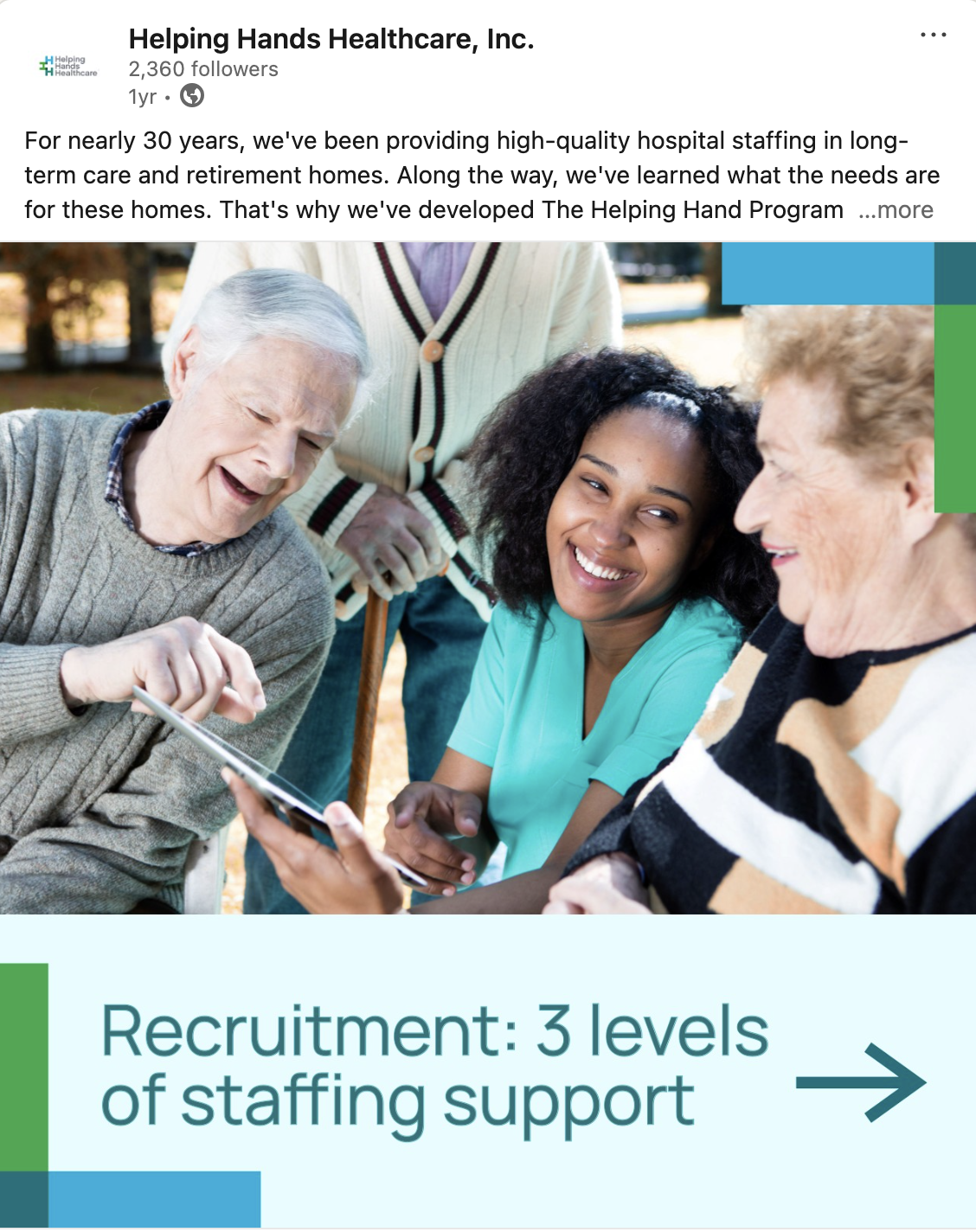
Visual Consistency Across Channels Every social touchpoint — profile imagery, post templates, graphics — was rebuilt to align with the refreshed brand system. The refresh covered LinkedIn, Facebook, and Instagram.
Template System To ensure the brand could scale beyond the launch, I designed a full social media template library — giving the internal team everything they needed to create on-brand content independently. The system covered a range of content types: announcements, staff spotlights, healthcare tips, and community moments. Formats included static posts, carousels, and video reels, ensuring the brand showed up consistently regardless of the content type or platform.
Messaging Framework The same tone that shaped the website copy — empathetic, clear, and professional — was translated into guidelines for social content.

Results
Website Performance
Load time improved by 80%, averaging under 2 seconds
AA WCAG accessibility compliance — top 3% of accessible websites globally
67% of traffic from organic search, indicating strong SEO performance
85% increase in new visitors month over month
Returning visitors account for 15% of monthly traffic, reflecting improved user retention
Social Media
70% Engagement rate improvement increased post-refresh
The client noted an immediate improvement in brand recognition and audience response following the social refresh